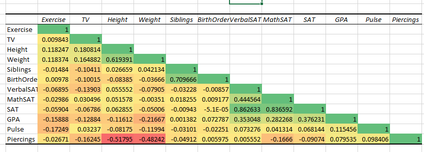
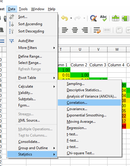
I won’t wade into the active debate about whether base graphics are better or worse than ggplot2 and qplot for R beginners (or maybe beginneRs…). Rather, I’ll document side-by-side those plots that we find useful in my intro stats class. In each case, I’ve let the default behavior speak for itself. The dataset StudentSurvey.csv comes from the Lock5 text “Unlocking the Power of Data”.
Notice that I initialize the ggplot object with each example below,
G=ggplot(data=StudentSurvey)
which doesn’t fully take advantage of the graphics grammar: if I was exploring this dataset with ggplot, I would do that initialization just once, and use the object in various ways with G+ geom_xxx
In each case below, the results of the qplot and ggplot commands are identical, so I’ll show only two plots: the base graphics and the qplot/ggplot.
After working these examples, maybe I start to see the point of those who claim that ggplot really isn’t more difficult for beginners. I think that if you have one plot to draw and you know how to do it with base graphics, there’s no reason to call upon the richer features and more appealing logic of ggplot. On the other hand, if you are doing work with a dataset that requires exploring with pictures, ggplot takes you much further.
Follow this link to another very helpful side-by-side comparison.
install.packages("ggplot2")
library("ggplot2")
Scatter plots:
 plot(StudentSurvey$Height,StudentSurvey$Weight)

 qplot(Height,Weight,data=StudentSurvey,geom="point")

G=ggplot(data=StudentSurvey)
G+geom_point(aes(x=Height,y=Weight ))
Histograms:
hist(StudentSurvey$Height)

qplot(Height,data=StudentSurvey,geom="histogram")

G=ggplot(data=StudentSurvey)
G+geom_histogram(aes(x=Height))
Box plots:
boxplot(StudentSurvey$Height~StudentSurvey$Gender)

qplot(Gender,Height,data=StudentSurvey,geom="boxplot")

G=ggplot(data=StudentSurvey)
G+geom_boxplot(aes(x=Gender,y=Height))
Side by Side Bar plots:
This one is harder. For base graphics, we need to make a table of counts for barplot to consume. The legend in base graphics isn’t drawn automatically, so you need to read the table correctly to enter the legend entries by hand.
I don’t know how to do this in qplot.
Notice the table and barchart ignore missing data, while ggplot includes it.
t=table(StudentSurvey$Year,StudentSurvey$Gender)
barplot(t,beside=TRUE,legend=c("First Year","Junior","Senior","Sophomore"))

G=ggplot(data=StudentSurvey)
G+geom_bar(aes(x=Gender,fill=Year),position="dodge")
Scatter plots with regression line:
#Base Graphics
plot(StudentSurvey$Height~StudentSurvey$Weight)
regmodel=lm(StudentSurvey$Height~StudentSurvey$Weight)
abline(regmodel)

# ggplot
G=ggplot(data=StudentSurvey)
Gp=G+geom_point(aes(x=Height,y=Weight))
regmodel=lm(Weight~Height,data=StudentSurvey)
Gp+geom_abline(intercept=coef(regmodel)[1],slope=coef(regmodel)[2])

#a ggplot alternative that doesn't require calling lm
G=ggplot(data=StudentSurvey,aes(x=Height,y=Weight))
G+geom_point()+geom_smooth(method=lm,se=FALSE)
Dot plots
Here base graphics function stripchart() takes some experimentation to get workable values for the parameters offset and at. By contrast, qplot and ggplot handle this as easily as a histogram.
Note however the vertical axis label “counts” in the qplot/ggplot dotplot clearly doesn’t match the scale of the axis, which looks more like a distribution, but probably not because I think the sum over that axis would be greater than 1. In fact the documentation of geom_dotplot admits to this error: “When binning along the x axis and stacking along the y axis, the numbers on y axis are not meaningful, due to technical limitations of ggplot2.” Argh…..
We should probably hide the y axis with +scale_y_continuous(NULL, breaks = NULL)
I learned from stackoverflow of another method using base graphics plot() together with sort(), sequence(), and table(). After some needed attention to the axis labels, this option looks to me like the winner of the bunch..
stripchart(StudentSurvey$Height, method = "stack", offset = .5,
                      at = .1, pch = 19)

qplot(Height,data=StudentSurvey,geom="dotplot")

G=ggplot(data=StudentSurvey)
G+geom_dotplot(aes(x=Height))

#Another way to get the job done using base graphics
x=StudentSurvey$Height
plot(sort(x), sequence(table(x)))

#Here's a custom function to make this last thing happen
dotty=function(x){plot(sort(x), sequence(table(x)),ylab="count",xlab=deparse(substitute(x)))}